
Mission control works because the data ages
Anonymised engagement — national retail chain, 84 sites. Day 30: the dashboard stopped being the point. The deltas are the point.
Anonymised engagement. National retail chain, 84 sites. Same chain as the original mission-control write-up, 30 days later.
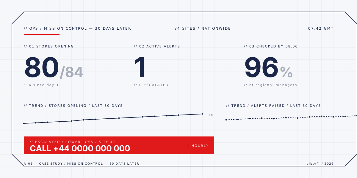
Day 1 of mission control, the screen carried three numbers, two trends, and a red alert bar. The numbers were the right three. The trends told a story no one had read yet. The red alert bar was the loudest thing on the page, and that was the design intent.
By day 30 the screen had aged into itself. Same three numbers, two trends, one alert bar. The numbers had shifted — 80 of 84 stores opening, one active alert with none escalated, 96 percent checked by 08:00. The trends had smoothed: the opening trend was a clean upward line with no scatter, the alerts trend was a dashed flat near zero. The alert bar had narrowed to about 60 percent of its day-1 width, and the phone number behind it rang less than once per shift.
What changed wasn't the dashboard. The dashboard was the same screen with the same data and the same layout. What changed was that the data had earned its place. The first 30 days were the period in which the operators learned which numbers actually mattered, which trends were signal and which were noise, and which alerts were worth a phone call. By the end of the period the data had aged into a working tool instead of a candidate one.
The hard part wasn't the engineering. It wasn't the layout, the typography, the colour rule, the choice of red. The hard part was the 30 days. Day 1 shipped a screen. Day 30 shipped a tool. The difference is what the data did in between.
Notes from the field: the first 14 days were a calibration loop. The operators had opinions, some wrong, and some trends were misleading for the first week. We watched, did not change the screen. Around day 18 a regional manager asked to change the alert threshold; we declined. The threshold was right; the data needed another week. By day 24 the alert bar had stopped being an alarm and started being a triage tool.
The lessons do not generalise. They generalise to one kind: a small, dense, single-screen interface fed by real telemetry, intended for operators who already know what to do when the alarm rings. For that kind of interface, the first 30 days are the product. The screen is just the canvas.
Mission control works because the data ages. The dashboard doesn't. Don't ship a dashboard and call it mission control. Ship a screen and let the data do the rest.